A new identity has been unveiled for club with the release of a new club name and logo for season 2019 and beyond.
Established in 1969, the club will be celebrating its 50th year anniversary next year in what is shaping to be an exciting season. Cairnlea FC, as it is today, has a rich history with many passionate and loyal supporters. Founded as Royal Park Soccer Club, it was here the club built its solid foundations before moving to Selwyn Park, Albion in 1983. It was during this period that the club established its strong identity and status in Victorian Football. However during a turbulent late 90’s, the club lost its home and underwent several name and location changes before settling in Cairnlea in 2008.
The Committee in 2018 took the opportunity to evaluate the club as a whole and address the member’s needs. In consultation with members, council and the FFV, the Committee developed a 5-year strategic plan (2018-2022) that identified 10 Key Priority Areas (KPIs) to help revitalise and grow the club. One these priorities was member retention and club growth, and for this reason a clear club identify and vision was established to better serve our members, the community and long term supporters.
It is with great pleasure and excitement that the Committee has officially changed the club’s name to the Albion Rovers Football Club (FC) and updated the club badge.

Club President Janev Aziz has been connected to the club for over 40 years and believes this is a significant step in the right direction for the club. “When you talk about our great club with people in the football community, they immediately identify Cairnlea FC as Albion Rovers, the powerhouse club at the peak of its existence through the 80’s, 90’s and early 2000’s. For this very reason, we wanted to respect our heritage and establish a clear identity” say Ms Aziz. “The new logo is modern, inclusive and respectful towards our current and past existence. We are very fortunate to have found our home in Cairnlea for the past 10 years. It is a fantastic community set for tremendous growth over the coming years. We we will serve the local community and reengage with our long term supporters for years to come.”
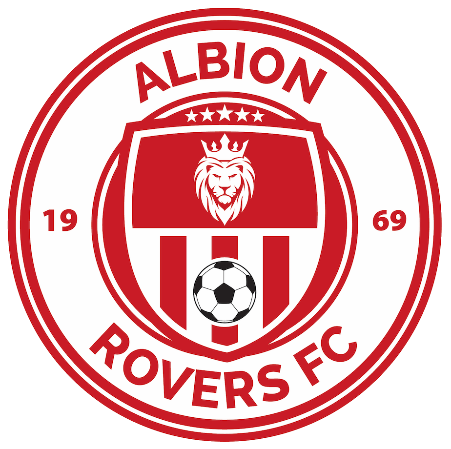
The Design
The new logo features a new lion to instill power, strength and confidence in reference to the club’s founding in Royal Park with the crown adding the royal touch. The stars above the lion demonstrate the club’s inclusiveness by combining all of the championship titles won by both our Cairnlea men and woman senior players. The ball used in the logo is a reference to the world cup ball released in 1969, the year the club was founded, and identifies the club’s purpose in the community as a football club. The red and white vertical strips inside the emblem is another reference the existing colours and logo of Cairnlea FC. Finally, the round boarder encapsulates the club’s history with the red and white colours of the boarder to respect our founding members.